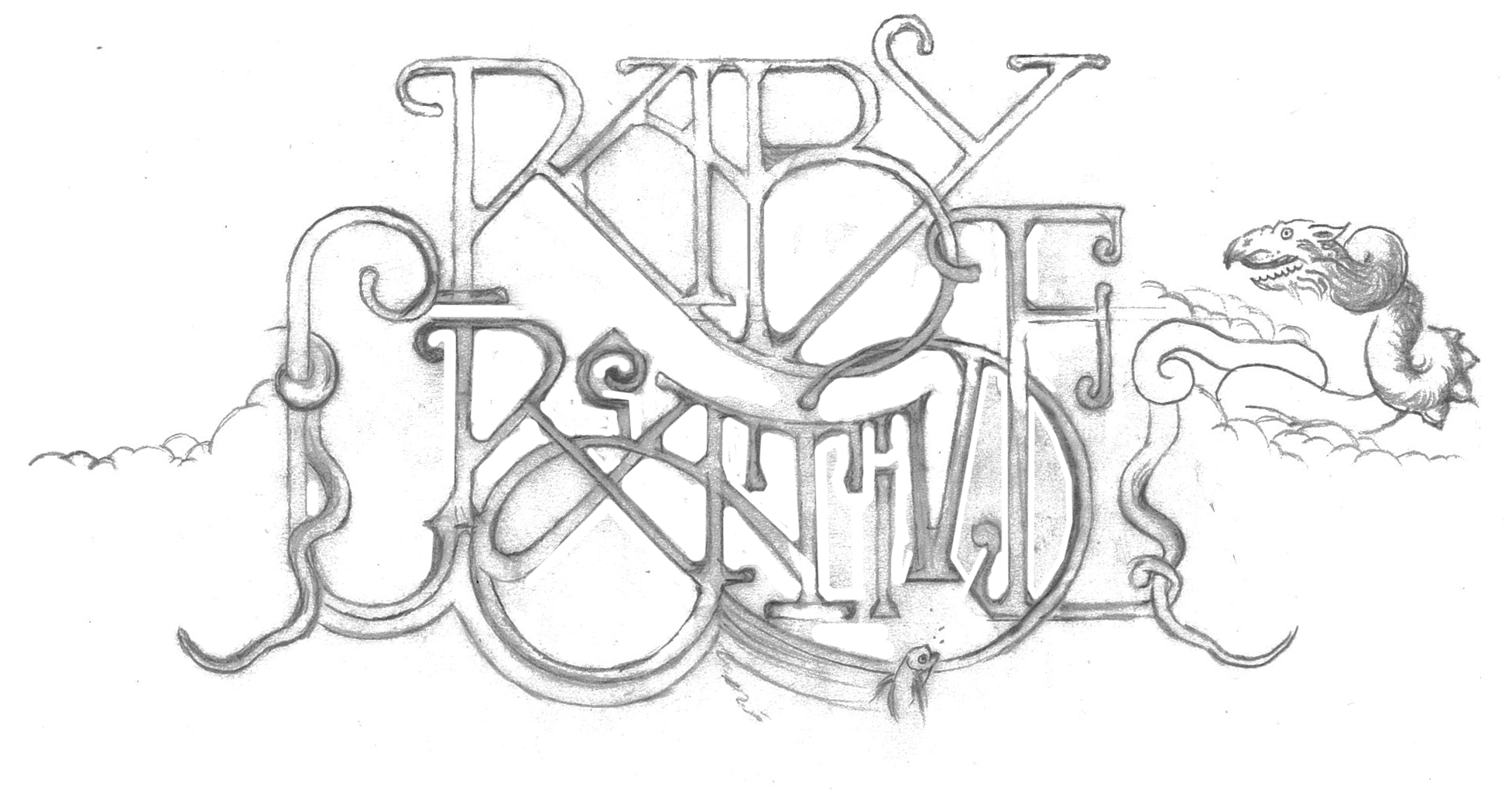
Raby Creative - Vaults
This promotional illustration promotes custom typography and hand-skills while featuring the three branches of Raby Creative offerings (design, experience, and sound).
The Outcome
The Challenge
Basically, portfolio site was basic. Who knew? According to my expert friend in UX/UI design, Behance was for college grads - not folks with my “caliber of experience.”
Visitors didn’t know the story behind my projects and the old platform didn’t really offer viewers a way to browse categories. Moreover, I was completely underselling my work as a musician, performance artist, and social practice artist.
I wore all hats in the role of design. My process involved heavy research in the development of digital magazine templates and a few trial and error runs.
Logo-wise, I started with thumbnail sketches, then laid out a rough comp in Adobe Illustrator for symmetry and balance. Then I refined it a few times on sketching paper.
The site speaks for itself, I think. I’m fairly proud of the new logo which I’ve used to effectively garner a slew of new custom typography and illustration clients.
Additionally, all my projects may be browsed via content blocks in a classic blog format.
If you’re here for design, you can easily peruse all relevant work to your industry or application. If you’re here for music, you’ve got it! I hope you’ll take some time to explore my mythic journey, or my performance art offerings.

