Meow Wolf - Texas Eclipse Fest
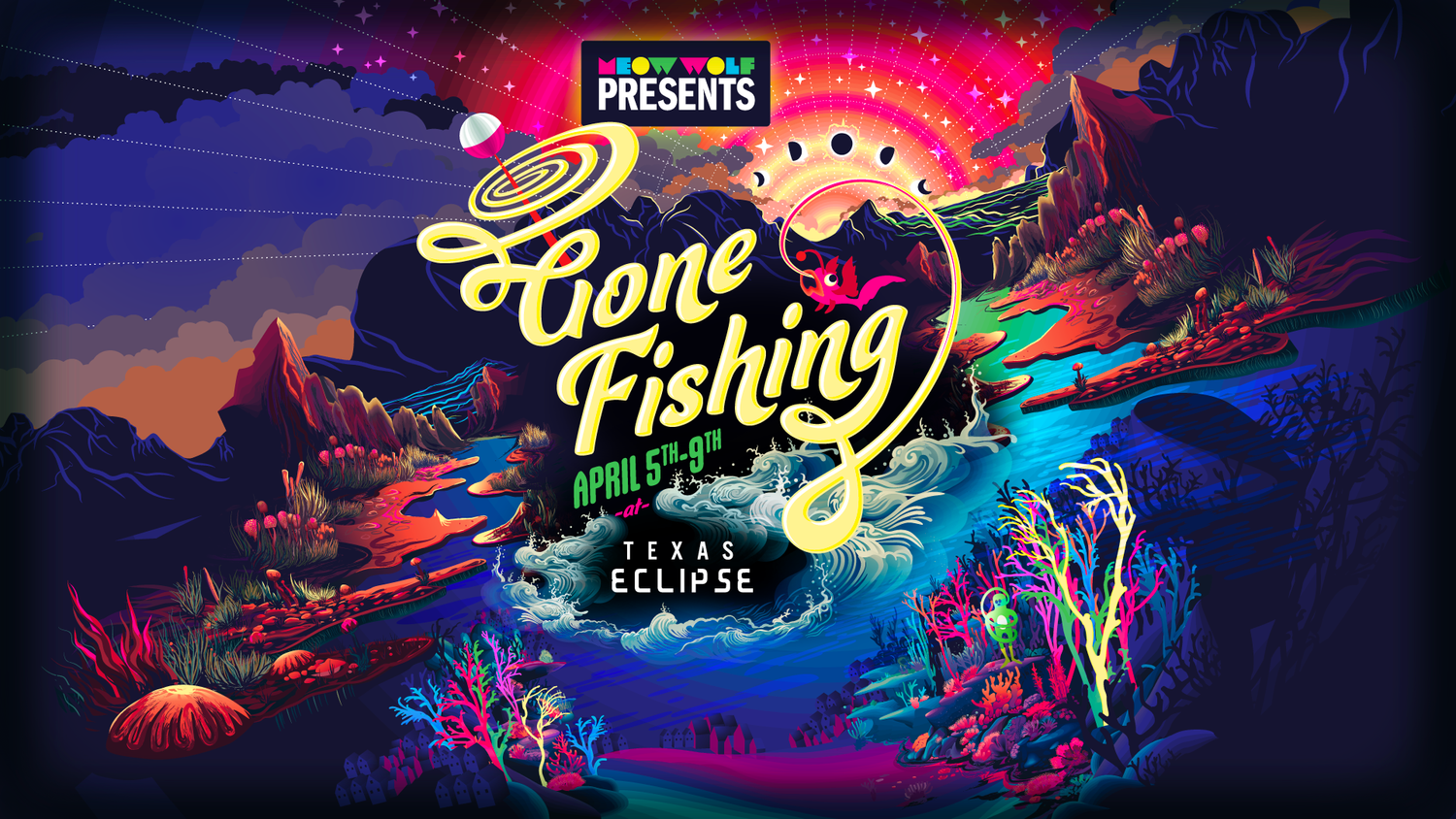
Meow Wolf’s presents “Gone Fishing” pop-up at Texas eclipse festival dazzled over 40,000 participants with a tackle-shop kitsch fishing experience
Role: Brand Direction, Experiential Marketing, Digital Promotions, Signage
Support: performance, booking, and promotions.
the team
Meow Wolf Presents is the events and activations team, headed by Sr. Director of events and activations, Marsi Gray, the brilliant Creative Director, Sophie Cruz and events Project Manager, Colleen Musgrove. Additionally, Amanda Siroskey headed up the marketing coordination of all social and ad programming.
Meow Wolf Presents team came to Meow Wolf’s in-house design agency with the golden opportunity to develop the branding, digital promotions, sign design, and merchandise development for the Gone Fishing experiential pop-up at Texas Eclipse Festival. It was an esteemed honor to lead the creative design alongside my trusty Project Manager, Ellen Corbett. I supported the performance and booking team with my deep connections in the festival and Austin performance art scene.
Here I am lounging with the brilliant performance crew!
the challenges
Meow Wolf had just launched The Real Unreal in Grapevine Texas just a year before and with the Houston exhibit underway, the challenge of building the Meow Wolf brand familiarity was essential to the success of new exhibits. Our gloquarium installation in Santa Fe and Grapevine exhibits had become a branding hallmark Meow Wolf leadership was eager to leverage in the pop-up experience. However, fishing in central Texas happens in rivers and lakes, not oceanic corals. Clearly presenting the Texas Hill Country with coral proved an interesting challenge.
Furthermore, Meow Wolf Presents was a new division positioned to amplify the events teams amazing work with its own sub-brand. This previously designed logo lock-up would need to nestle into the communication hierarchy without competition.
The GOals
Amplify the Meow Wolf Presents brand awareness.
Create a unique logo lock-up that speaks to fishing and the eclipse.
Ensure that the design is scalable both vertically and horizontally and can express in hundreds of ad formats and variations with animation.
The Process
As with all projects, it began with a kick-off meeting wherein we overviewed all the channels for which assets needed to be created. We identified the communication hierarchy, project parameters, approval roles, and must haves for the design.
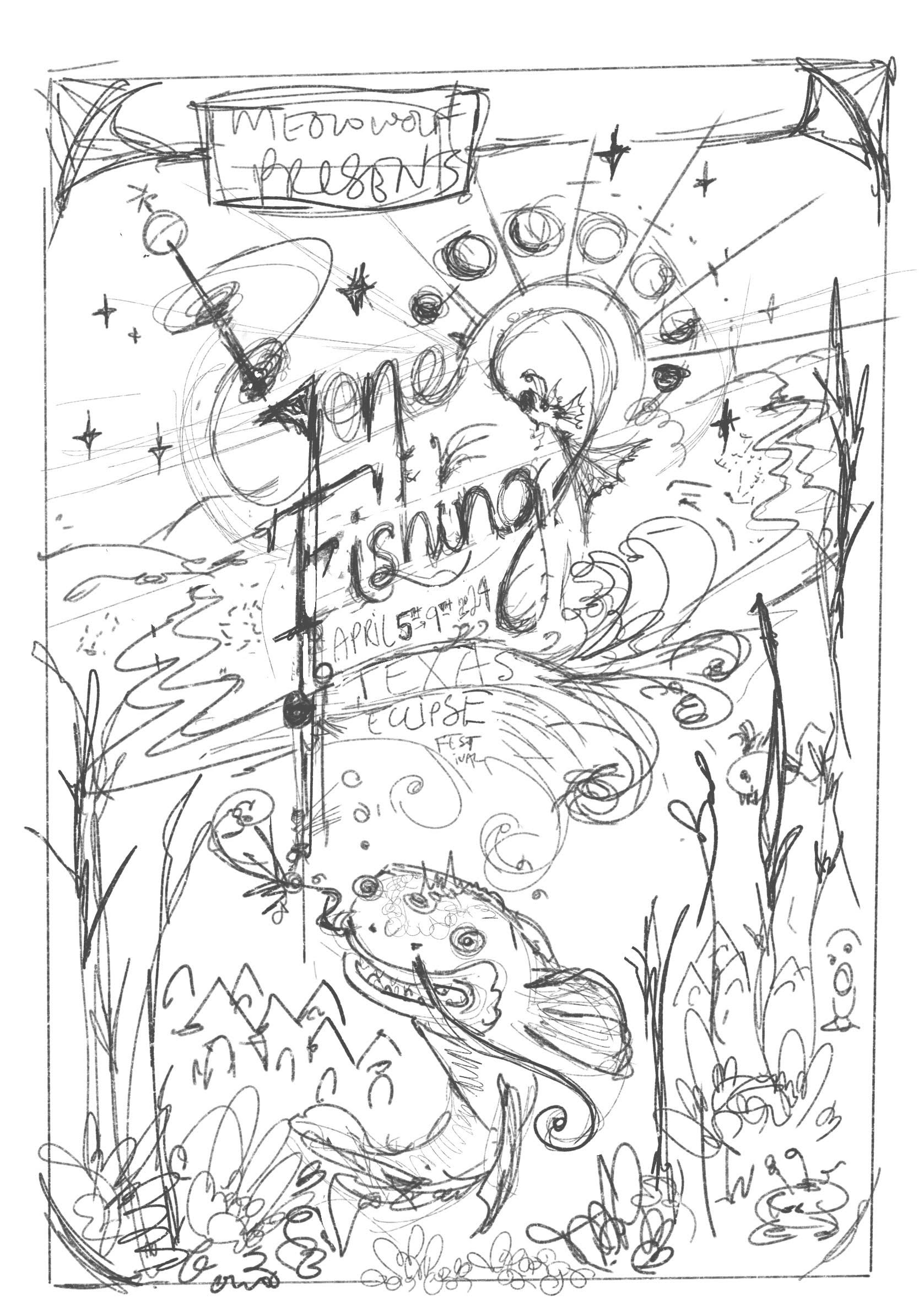
I articulated all these parameters in a presentation deck and pulled together four clear mood boards targeting three very different illustration styles. Alongside each style, I articulated what the hallmarks were within each aesthetic, eliminating guesswork about how it would express. Additionally, I provided a rough sketch alongside each mood. Most sketches were interchangeable with the moods but one was not.
I presented the creative to the broader team and they had a very difficult time choosing which sketch and mood board to go with. We ultimately landed on a hybridized version of a 60’s travel poster and the following sketch which I happened to render while watching live jazz over sake.
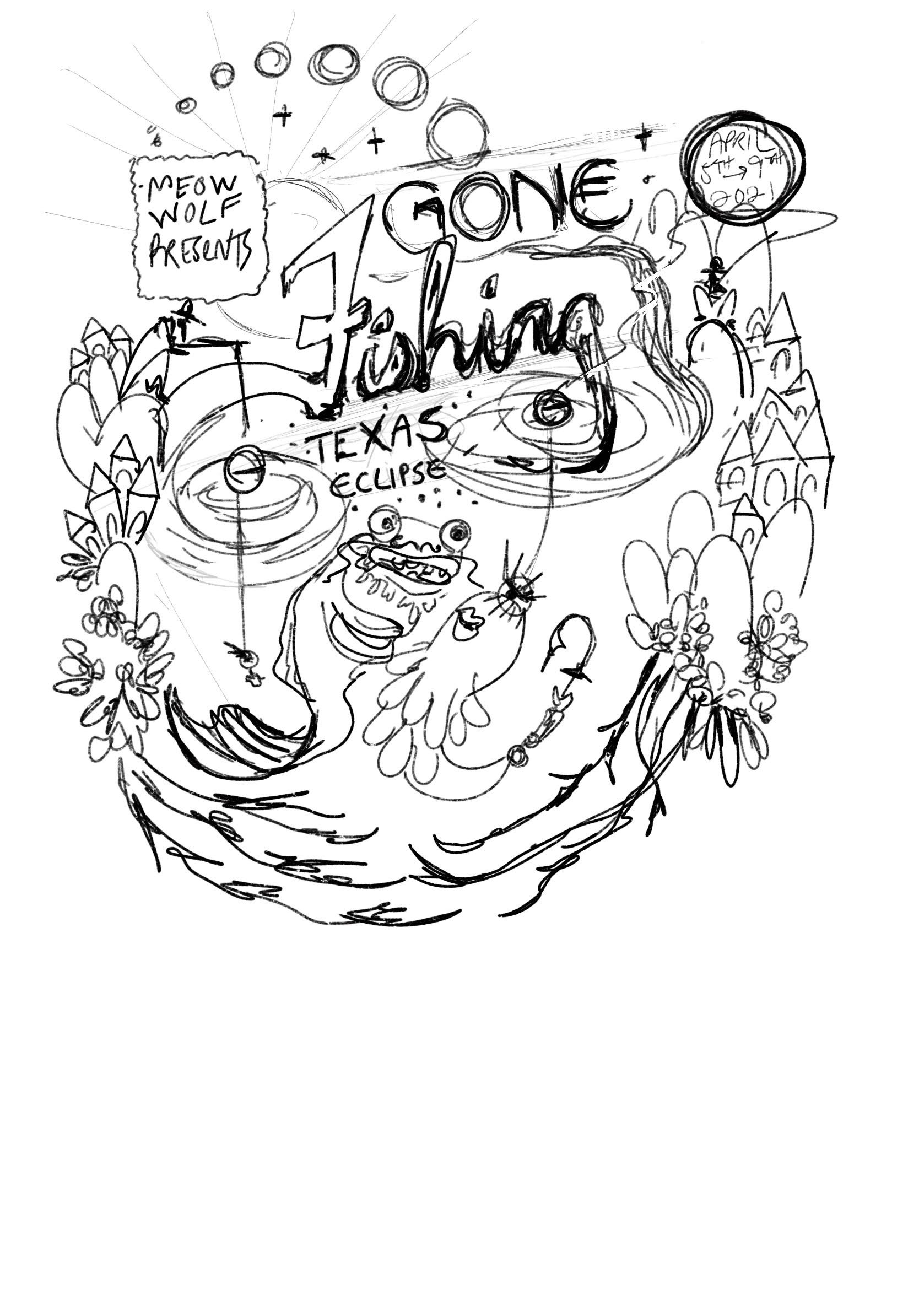
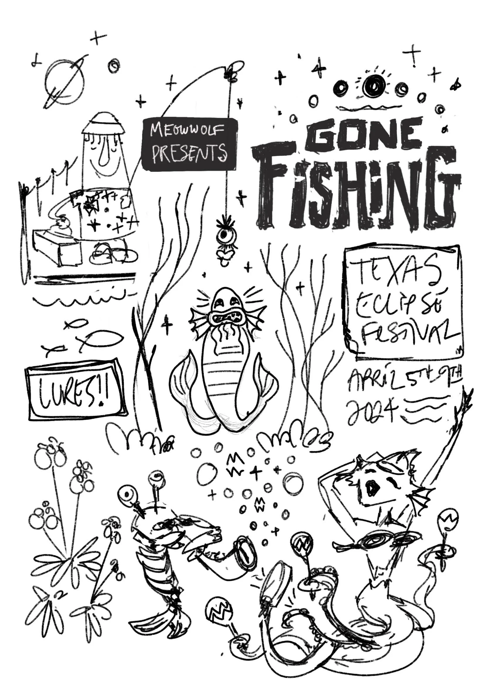
These alternate sketches were not chosen but the image below on the left was a close call. It was originally presented alongside the midcentury travel poster mood board which was applied to the main general graphic.
Production + outcome
With the sketch and mood board approved, I set out to render a custom typographic logo and an adaptable digital illustration that included all required elements. We secured multiple team checkpoints along the way, but after about 80 hours of illustration and production time in Adobe Illustrator, the final general graphic was complete.
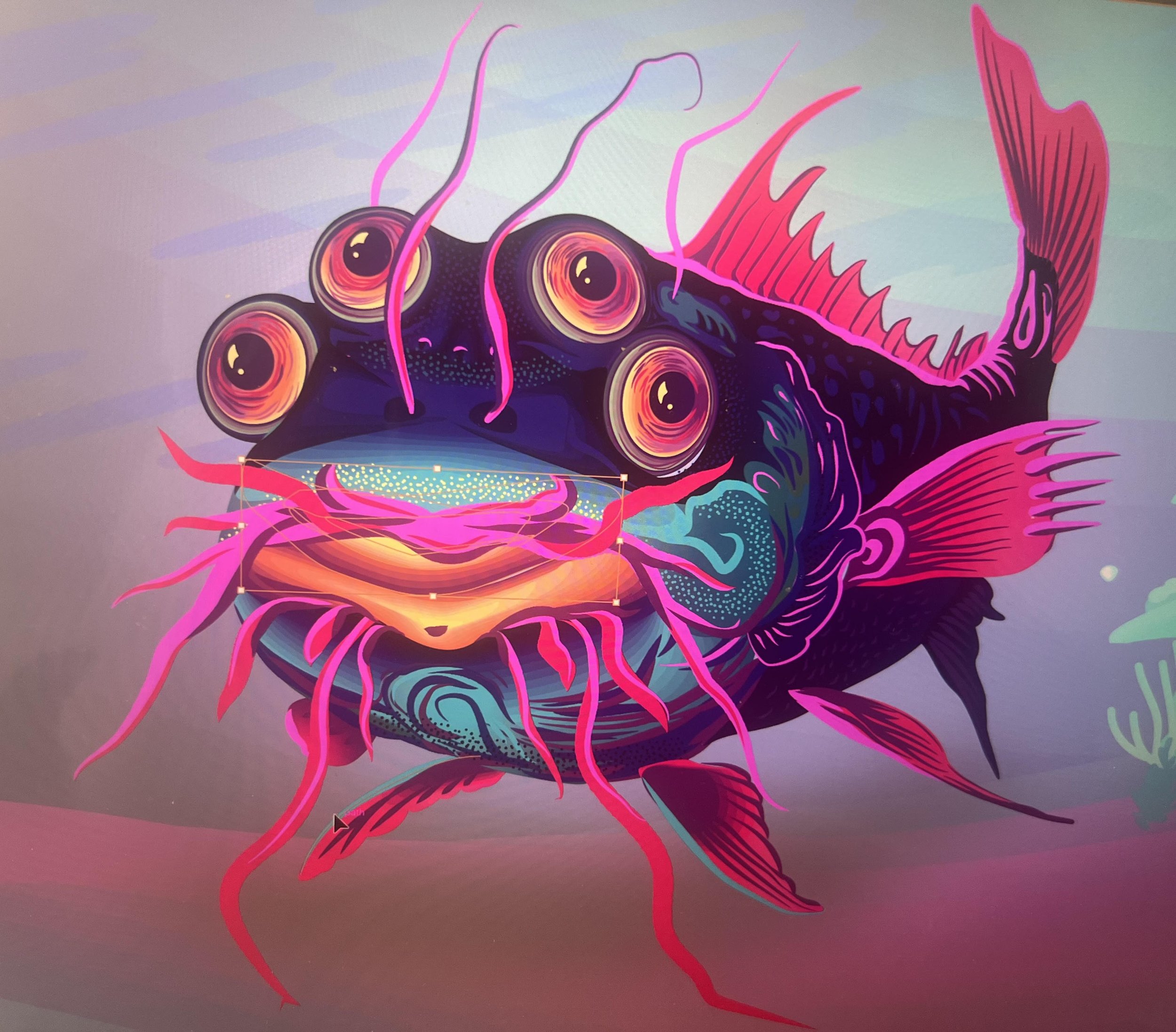
The catfish was voted to be removed from the design but he would have been lovely on merchandise and as an animation.
I strategically merged specific layers and backgrounds and built an Adobe Library for the brand in preparation for set up in Adobe Express. This social asset tool allowed me to rapidly generate multiple formats and versions with simple animations while allowing the events team to make minor edits to copy. This graphic extended to all ad sizes, merchandise, and print posters.
Environmental Signage Production
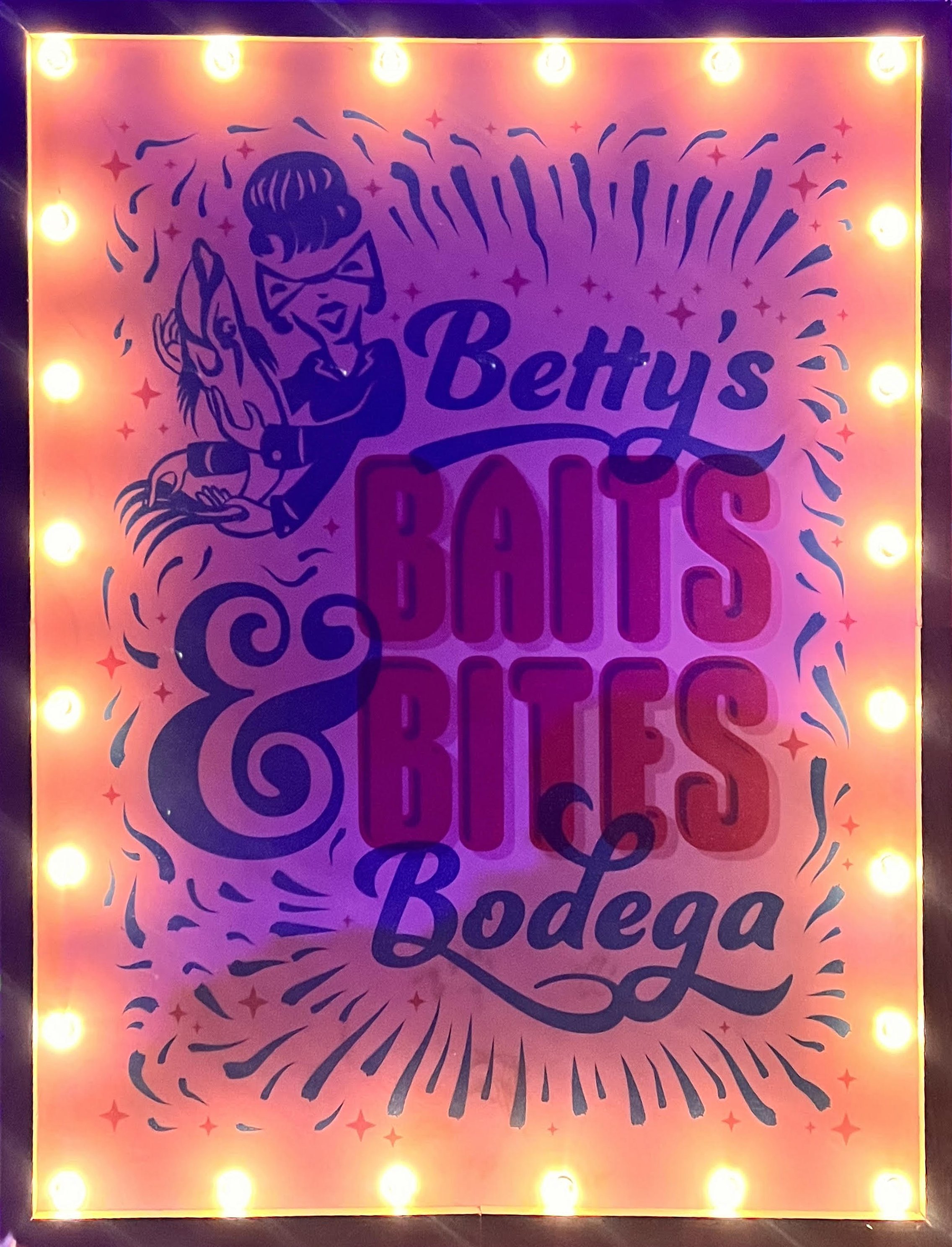
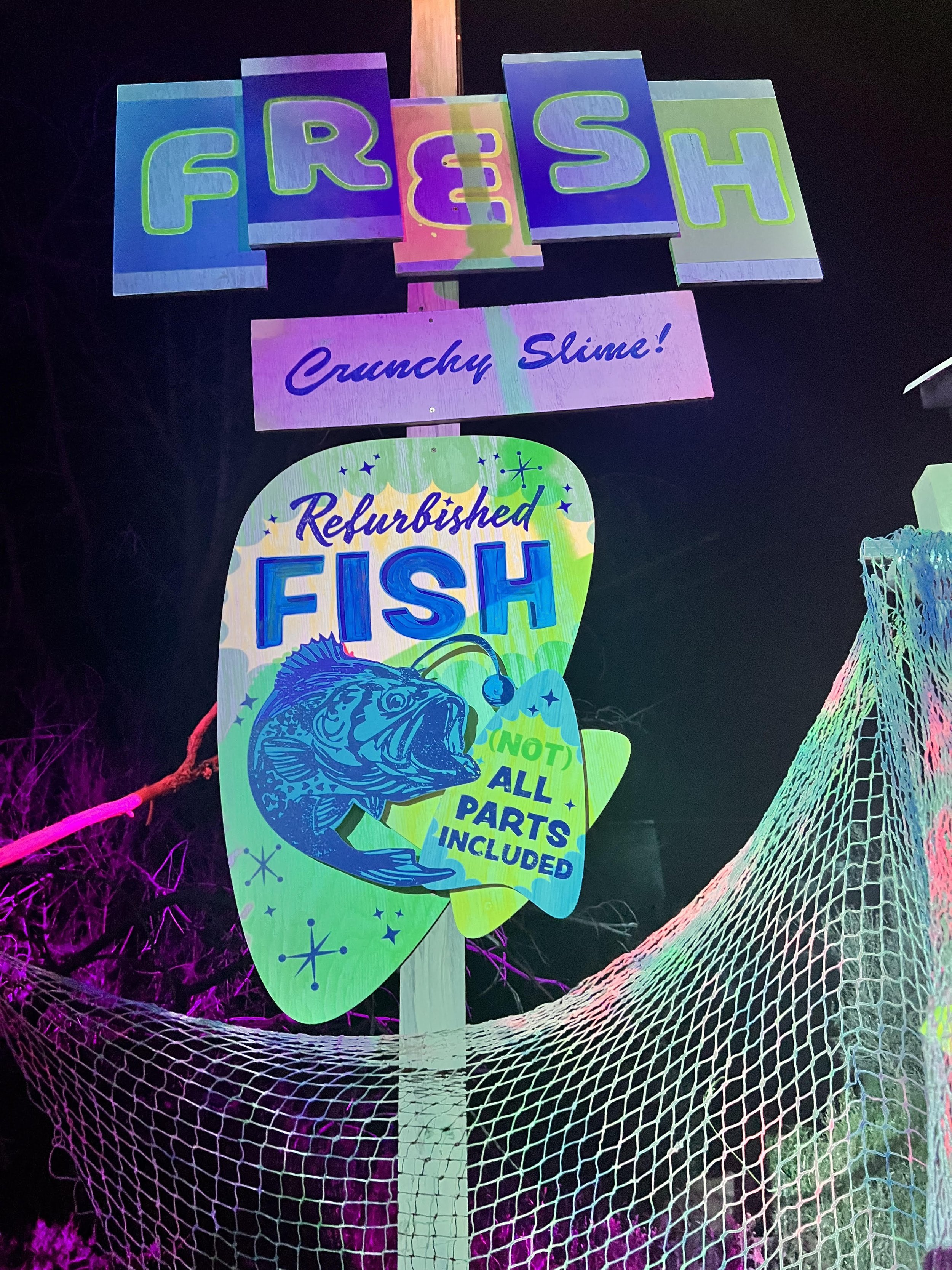
I worked closely with local printers, Color Reflections, to pull together quick turn quotes, printing and shipping. I designed and press-checked two super groovy signs on a very quick turn. Had I not nurtured the established relationships with Color Reflections, we might not have known what was possible or been able to render these larger scale signs on quick turn. Once the signs were on-site, they were assembled to spec with additional frosting. The midcentury pop-styling of the general graphic continued as a through-line in signage and stage designs.
Meow Wolf lends itself to he low-fi DIY aesthetic. This lower sign section was printed on three layers for added dimension and interest.
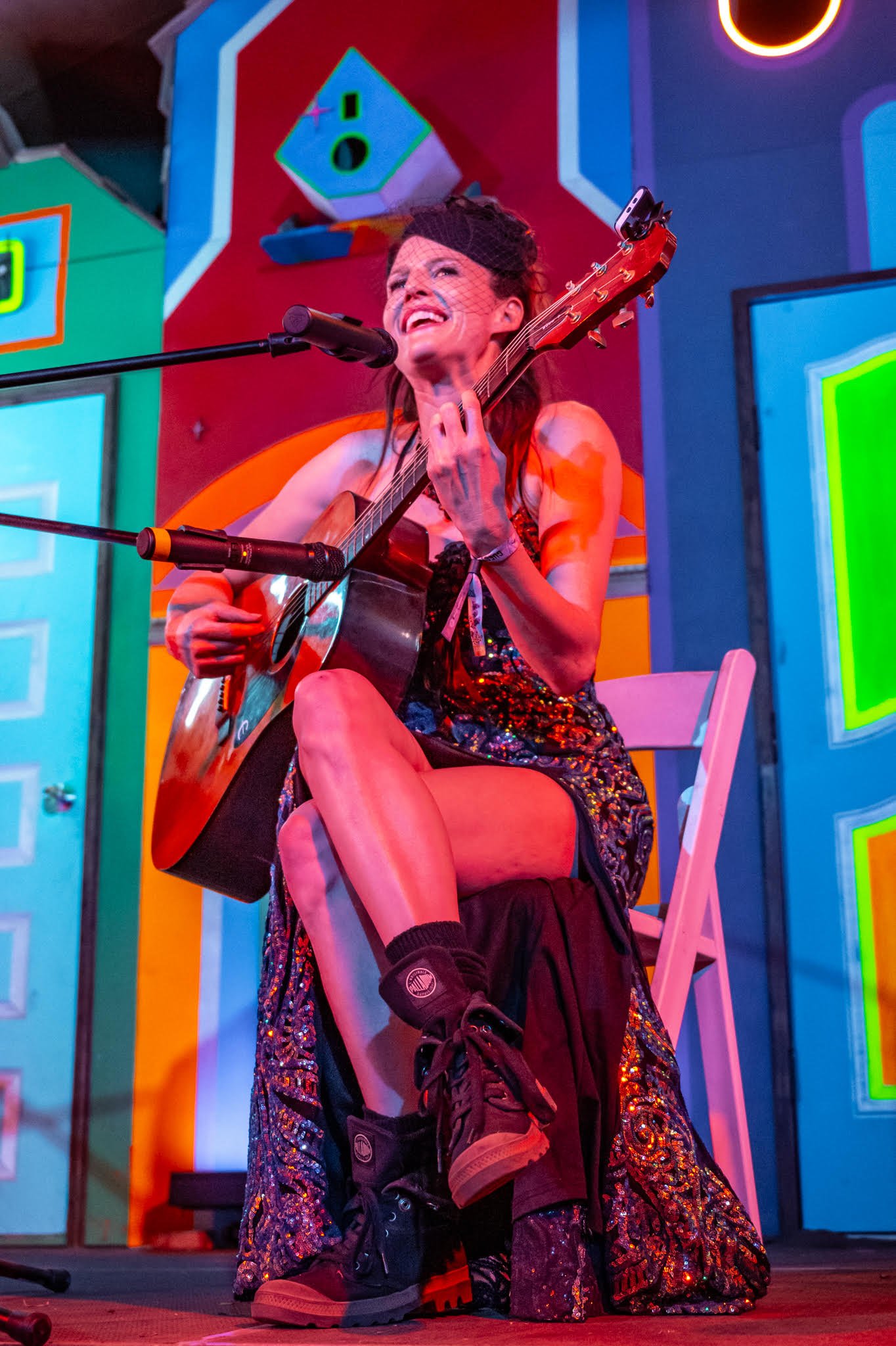
I was so honored to have both performed the late night Bedtime Stories Burlesque show alongside DJ Lady Vitamins. The whole production crew was a dream to work with and the experience of the Texas Eclipse was equally as transformative.


