Orphan Angels World Wide
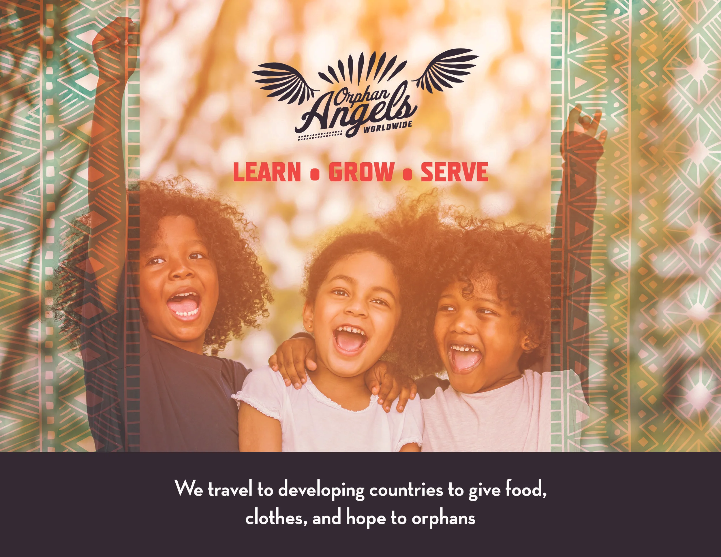
Orphan Angels World Wide brings food, clothes, toys, and aid directly to orphans in developing countries. Raby Creative volunteered to develop their branding package.
The Outcome
The Challenge
As a new company, Orphan Angels World Wide was just establishing themselves. They needed more than a logo. They needed brand elements that could extend to all touch-points: social, events, website, print, and hospitality.
The Role:
Raby Creative, 'tis I, developed the brand architecture, logo, sourced the photography, and offered consulting on brand execution and social strategy.
The leaders at Orphan Angels were able to integrate the assets I provided into all their essential media outlets with clear artistic direction and brand architecture.
They also have a clear social media and business strategy to gain exposure and help the orphanages set up sustainable businesses to better impact their communities.
I'll continue to provide consulting and volunteer design work for Orphan Angels annually.
The Process
Interview:
Orphan Angels asked for a logo. They didn't realize that branding is more than a logo!
I provided direction for copywriting and a more clearly defined mission and company values so theses may be echoed throughout all touch-points.
Research:
Since the new company is not becoming a non-profit, the digital marketing strategy would be completely different from other companies like OOWW. Their social campaigns would target the same audience as adoption agencies, but their business model lended itself more to developing sustainable businesses via Shopify.
The marketing strategy consisted of developing a global digital marketing campaign with Instagram, Facebook, Many Chat, YouTube, and of course lead-magnets and email.
Defining the Specs:
Beyond the basic logo package, Orphan Angels needed design assets that were duplicable across multiple mediums. We would define the brand architecture document and solve for the various media outlets they'd need in order to execute the digital marketing strategy.
The Design Process:
We began with a basic homepage and logo design in 3 different directions.
The logos were all vastly different. The client loved the idea of inviting all the kids to lift their hands overhead while taking pictures as a branding benchmark. They also loved the direction of the middle logo above. After a few more rounds, we settled on the following brand extensions.
OOWW now has a complete branding and logo packaging with elements to draw from when developing their digital media assets.


