
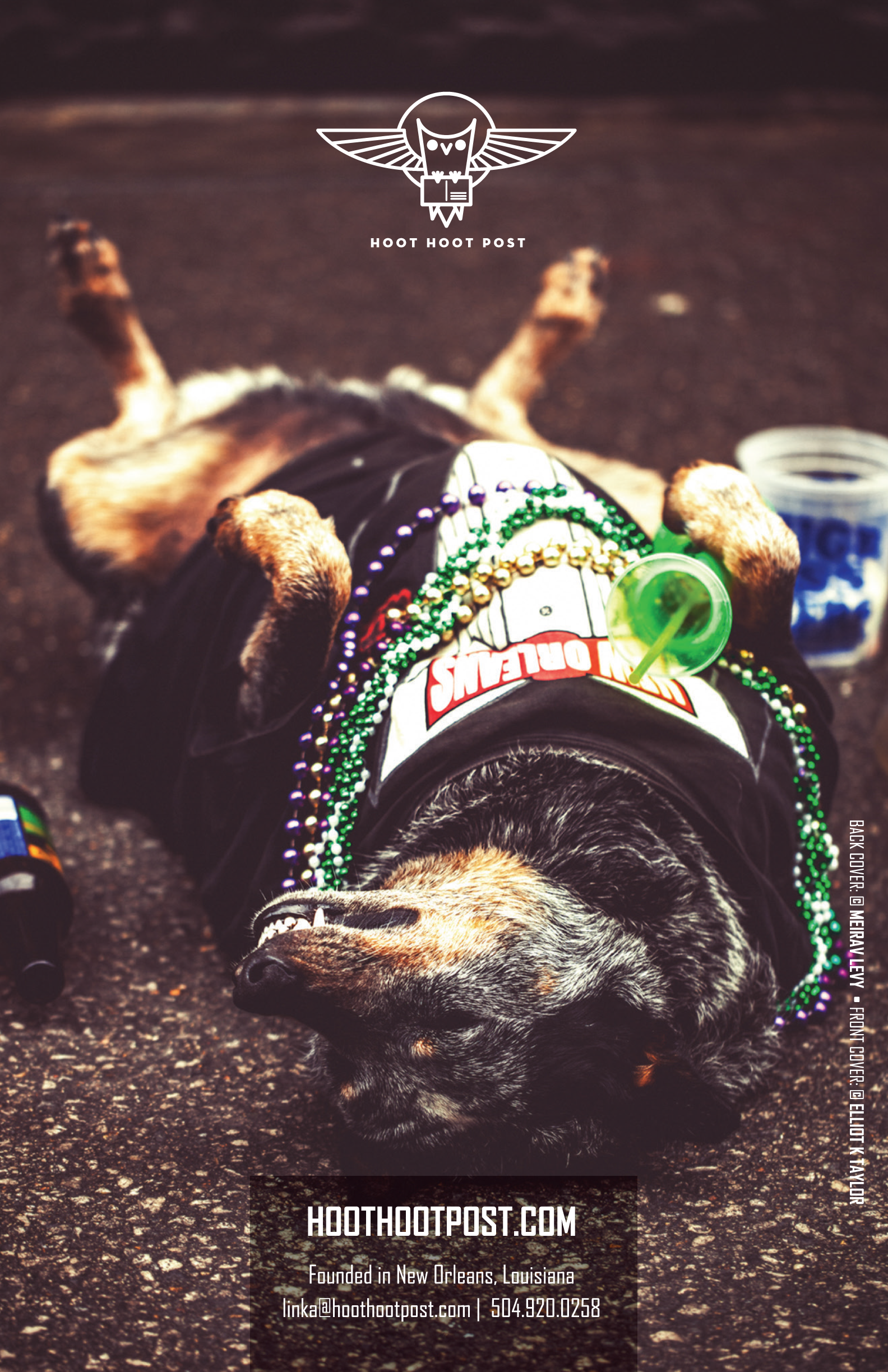
Hoot Hoot
Linka Odum of Hoot Hoot Post commissioned the branding and launch kit for Hoot Hoot’s debut of their New orleans postcard line.


The Outcome
The Challenge
Hoot Hoot Post was a new product line with no established brand awareness. The launch would propel the new product line of regional postcards into locally owned boutiques and tourist spots. Hoot Hoot Post needed a launch kit on a start-up budget.
The Role:
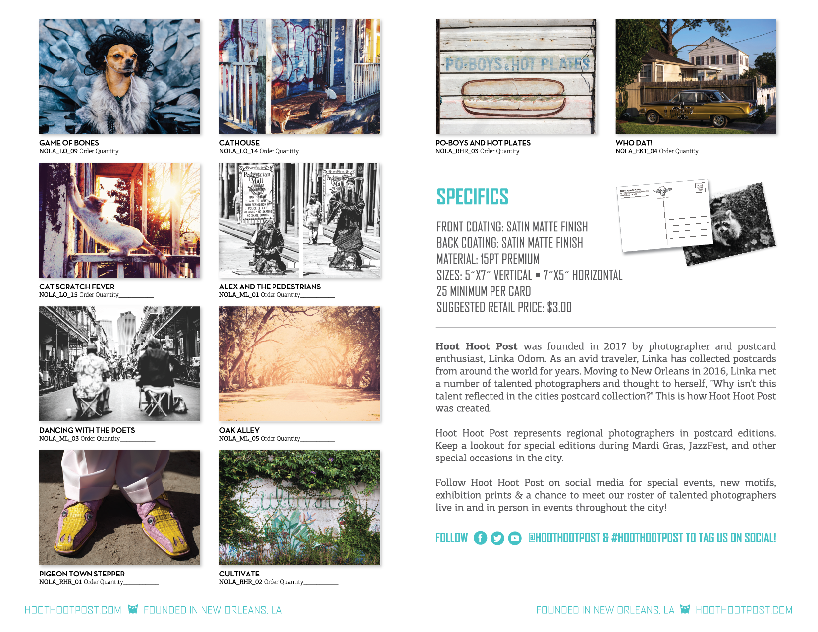
I developed the Hoot Hoot logo and brand architecture and then extended it to a Catalog, Order Forms, and Postcards.
Hoot Hoot Post is now featuring local photographers in several boutiques in New Orleans. The company plans to expand to other cities and build out a website.
The Process
Interview:
I chatted with Linka to identify her goals, budget, and mission for Hoot Hoot. She gave me the rundown on competitors and how she wanted her brand to evolve.
Defining the Specs:
Linka asked me to draw inspiration from her personal site, The Missing Linka, and "clean up" the logo to vibe with a more "euro-modern" twist.

Starting with this.
She also provided a few catalogs for other postcard companies in Europe who's aesthetic she really loved.
The Design Process:
Since our budget was very tight, we skipped the preliminary research phase and dove head-on into design. I began with the logo. Linka's original logo featured an owl. Hoot Hoot also would feature an owl, but we needed something more glyphic and graphic.
Linka was simply in love with the new rendition and we promptly began developing the catalog which, in-turn, served as Hoot Hoot Post's brand architecture document.
I proofed the layout and type without images first and later placed the images with their corresponding copy.This process was a snap as all assets and copy were provided at the onset of the project.