
Vet's Best
As the in-house Art Director at The Bramton Co., I directed the branding and packaging design for, Vet’s Best, the newly acquired line of natural pet care supplements.
Role: Art Director - Brand Strategy, Packaging Design, Retail and Digital Marketing, Publication Design, Product Design

The Outcome
The Challenge
Vet’s Best was a fantastic line of natural pet care products, newly acquired by the Bramton Co. The diversity of products in the line meant that we needed to solve for new packaging specs and sourcing from both American and Chinese vendors. The Vet who created the product line was brought on board to consult on copywriting which meant that we would need new copy for every product.
Additionally, we wanted to launch into Pet Specialty with a BANG, so we needed to perform intensive research and focus groups. All of this created a tight timeline for the in-house design team because the amazing sales team at Bramton had secured pre-sales with major distributors - And yes! Before the new branding was established.
Lastly, the product manager was brand new to the role. We would need to collaborate closely and keep fine-tuned communication to keep the projects managed effectively.
The Role
As the Senior Art Director managing the Vet’s Best account, I collaborated with the founder of the product line to identify the backstory and core brand essence. I designed a top-level creative brief and brand essence based on this and market research provided by the product managers.
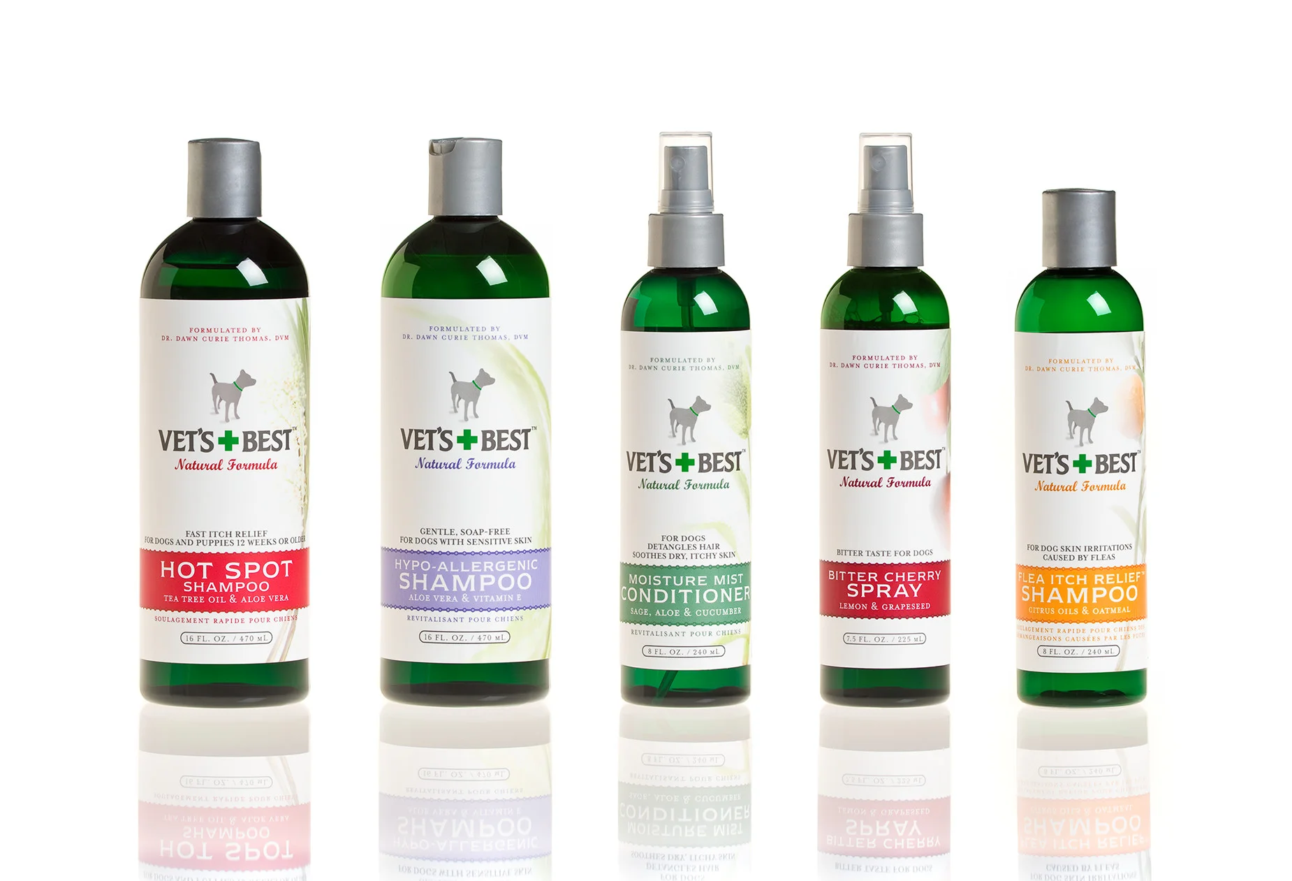
Bottles and label stock had to be ordered before branding so production could hit the ground running and hit the in-store deadline. I made the green bottle and pearlescent label recommendations based on purchasing parameters and the creative brief.
Then I contracted and agency to develop designs to supplement in-house designs for the focus group based on the creative brief. Then I defined the brand architecture based on the Focus Group in collaboration with the agency and Dr. Dawn.
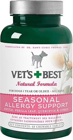
With the benchmarks established, I directed the extension of the branding across all 75 SKUs in multiple languages and sizes. Additionally, I directed the photography and retouching of over 150 herbs and spices. I worked closely with print vendors while mentoring the design and production team to execute the designs on brand, to spec for flexographic, chipboard and poly-film printing.
I also coached the team on effective asset management, photographic styling, and product photography.
After the packaging projects, I conceptualized all marketing assets, point of purchase displays, shelf-talkers, catalogs, front-end web design, and interactive games shelf talker games.
Vet’s Best successfully launched into Pet Specialty with a $473% in increase in sales from the previous owner. While the branding has shifted a little the Vet’s Best brand still corners the boutique market on Natural Pet Care.
Additionally, Vet’s Best has launched into digital mass distribution on Amazon, Overstock.com, Shop.com, and more. The line is now available transcontinentally to the UK, France, and China!


The Process
The download
When the company was acquired, I visited at length with the visionary, holistic veterinarian, Dr. Dawn Curie Thomas. It was clear that “Dr. Dawn” was a back to basics, gal. Simple, natural solutions for happy animals. She had genuine concern about the amount of cortisone being used in vet clinics and she’d solved for very clear and simple prevention strategies and long-term care.
With over 75 products in the line, we would need to carefully study the market as we moved into a redesign of the product line. The information Dr. Dawn gave me was distilled into a creative brief wherein the brand essence was defined by the backstory, the originating vision, the core values, and the core mission of the Bramton Company aligned with Dr. Dawn’s mission. This creative brief would be the guiding compass for the next phase of our project.
design timeline parameters:
The sales team at Bramton Co were good. Sometimes a little too good. They’d pre-sold the line to a few Pet Specialty stores on the merit of the products alone, before the brand was fully developed. So we had to get really strategic about the production process to make sure we hit our delivery deadlines.
We knew we had to do a focus group and market testing so that we could validate and quantify our design decisions to our buyers and emerge as industry thought leaders. But the production needed to get started right away. We hosted a short market survey, simulating an online shopping environment. Customers favored the green “glass” and pearlescent white bottles over brown or cobalt “glass”, black satin, or white bottles.
The creative brief for the focus group included solving for both pearlescent and green bottles. Bottle vendors were put on alert and armed to pull the trigger for orders for all 75 products in either option.
THE FOCUS GROUP designs:
The creative brief and bottle images were shared with a contracted design agency and, like the Simple Solution rebrand, we had the agency develop six designs for each bottle color.
We simulated a shopping environment with actual packages and gave the consumers 45 seconds to survey the brands and shop the products. They were removed from the aisle and questioned about which packages they remembered, what they remembered, which one’s they would have bought, and what feelings they got from the designs.

These designs were among the target demographic’s favorites.
In the end, the green bottles were favorited due to the contrast of thw white label against the dark green and because customers had feelings that aligned with the core values: “simple, clean, natural, scientific.”
In focus groups, consumers remembered the “dog” icon and the plant in the background which they said felt, “Natural for Pets”. The green cross also stood out as a key iconic meme.
Customers also clearly remembered the pearlescent paper stock.

extending the branding
With the benchmark solved, the bottle vendors pulled the trigger to order green “glass” bottles, lids, and caps. I guided our in-house production artists to carefully photograph, retouch and name the images for use in digital mockups.
I set out to book the photography and source the herbs and spices for the images used product labels and branded materials. While the herb images were a very subtle detail, we needed lots of angles to “play with” as the compositions and crops varied from label to label. I worked with another production artist to retouch the images and prepare them for both press and web.
I’d implemented a project management system that gave our team a visual reference for where each product stood in the design process. Like Simple Solution, every product was rendered in multiple sizes and languages so keeping the process well organized was key. I mentored our in-house designers as we extended the brand architecture across each label and guided them in best practices for flexographic label printing.

With the labels complete, I attended press checks across the nation and worked closely with printers to ensure the color, impression, coating, and registration met the high standards of excellence dictated by the brand.
Printed labels from every press check were brought back to the team along with reports on our printing partner’s service and skill.
With the labels designed, approved, and prepared for press, each file was converted into a digital mock-up for use in our marketing materials. Our in-house team took on this task as I attended press checks. These assets were prepared for both print and web and quickly shared with our pre-sale vendors for use on their sites.
marketing, sales, and P.O.P.
The product family was large and consumers were at risk of overwhelm so we developed an interactive shelf talker which allowed new customers to explore the product line based on their specific needs.
The Vet’s Best Solutions Wheel was color coded to match each product family and severity of condition.
This was a huge hit with consumers and distributors because it “gamified” the shopping experience at the shelf.


The external agency was tasked to develop a binder of sales sheets and price sheets while I guided our in-house team to develop the product catalog, point of purchase displays, and front-end web design. We outsourced the coding and development of the site while providing strict art direction and brand architecture guidelines. I worked closely with printers to ensure that all printed sales and marketing materials met our brand standards.

I left the Bramton Company soon after the implementation of Vet’s Best but Im proud to have been such a foundational force in the brand’s success, as well as the health and wellness of pets all over the world.